Creating a scalable cohesion between brand and product in the growth department.
Overview
Establishing a point of view for DAZN's first impression
When I joined the DAZN growth team, I was in a unique position, focusing on our first point of contact with users through search and landing pages. While liaising with the brand team on campaigns and being introduced to back-end operations, it exposed the fractures in our brand and how it was being applied across our landing page experiences.
I set out to create alignment that would establish a point of view around how to give the DAZN brand a proper home for first impressions. The result became a narrative tool to overhaul our landing pages, enabling users to engage with our product before even signing up.
Context
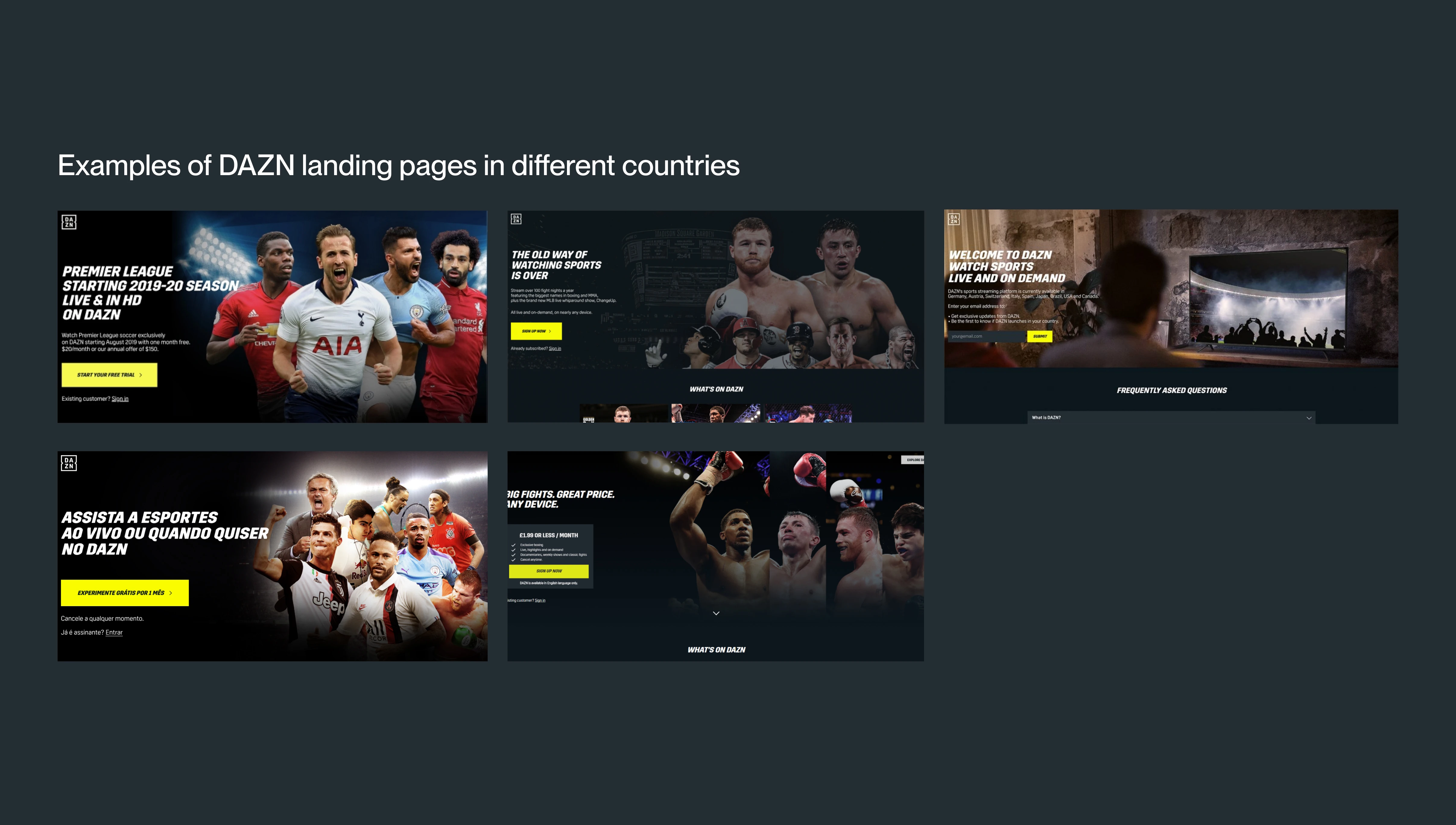
Fragmented brand execution across a global product
As various revenue product teams worked toward their individual goals, we ended up with fragmented implementations of our web experiences. Each team was pulling in different brand directions, resulting in a patchwork of inconsistent design decisions that didn't reflect DAZN's ambition or identity.
Without a shared perspective on how to represent the brand in product, each team defaulted to their own interpretation, creating inconsistency that users experienced as confusion and dissonance at the very top of the funnel.
Discovery
A global workshop to surface the fractures
I facilitated a global workshop with cross-functional partners to identify inconsistencies in our brand and componentry, prioritise focus for an MVP, and create a shared perspective around brand elements in product.
Language inconsistencies in how we presented DAZN from a design perspective.
Tone of voice inconsistencies across markets and product surfaces.
No interactive or product examples; users couldn't see what was behind the paywall before signing up.
Misinterpretations or old assets from the DAZN brand being used incorrectly across teams.
Several different component versions and styles, leading to brand fractures that were visible to end users.
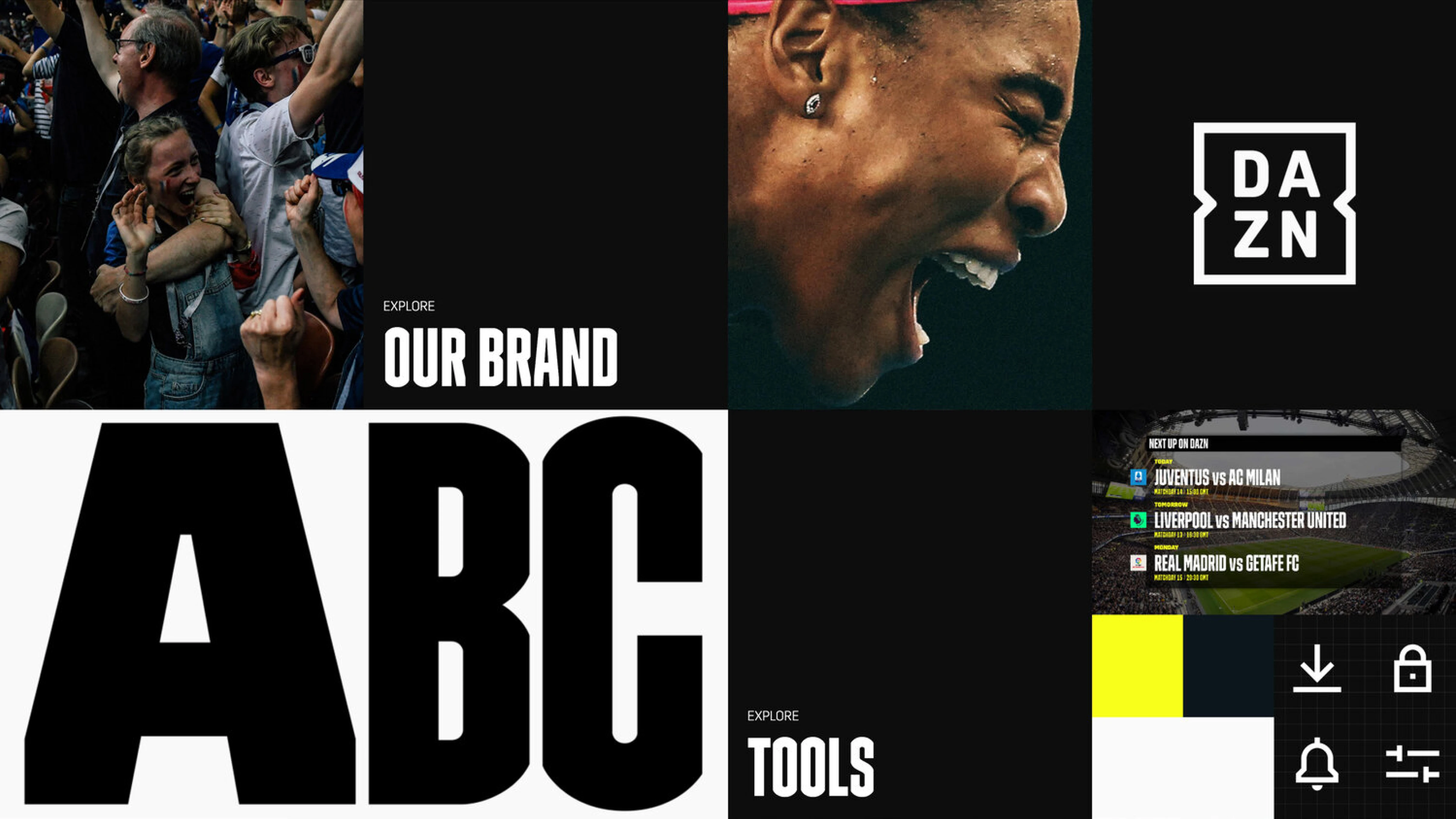
I worked alongside the brand and creative team to provide context to the current state of our presentation. They gave an overview of the brand work: leveraging creative photography, colour, and language. We partnered to explore how to create an inspirational base that could guide teams globally to represent the DAZN vision.
Design Principles
Three themes to guide the entire experience
Simple
Keep in mind who a user is and where and why they have come to DAZN for the first time. Reduce friction, remove ambiguity, lower cognitive load.
Engaging
When users explore, content should be discoverable and available with no barriers. Bring the product experience to the surface before sign-up.
Inspiring
Leverage DAZN's rich creative photography, bold colour, and authentic voice to create an emotional connection with sport fans at first touch.
Ideation
Bringing new users closer to the product
I was curious about how to bring fans closer to DAZN before they subscribed. This could help build consistent expectations and streamline how teams work together by leveraging shared elements. While working on this, I was liaising with multiple teams to foster alignment on this vision of bringing the user closer to the product.
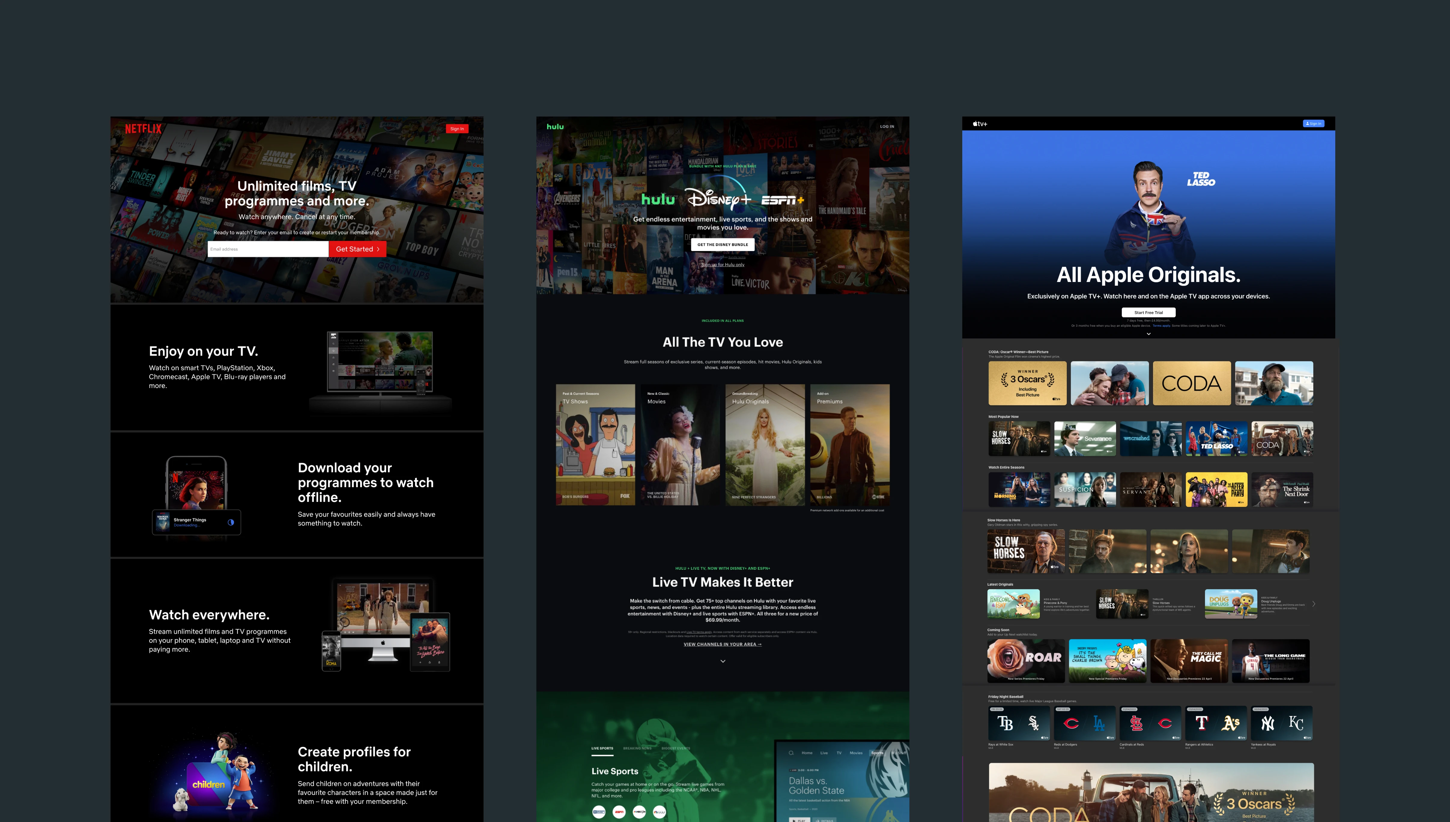
I engaged with engineers and delivery teams to understand the viability of having a sign-out version of the DAZN product which offers all the content without being able to view it. We found this to be a better option as it required no new design components and created alignment across the board.
Outcome
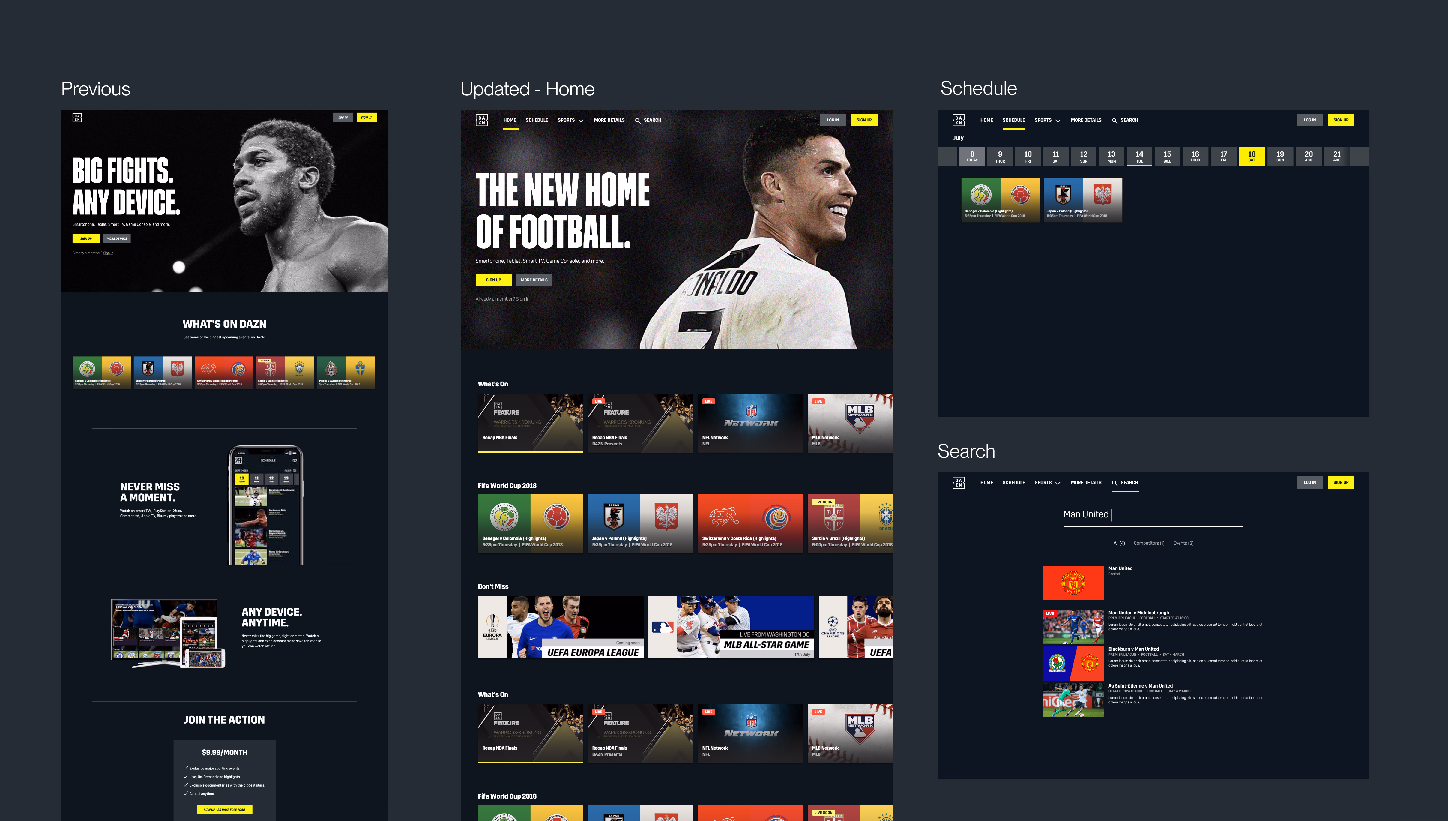
A shared brand language that scaled globally
By creating a shared perspective across multiple teams around the globe, we were able to create a tighter relationship between the brand vision and users' connection to the product.
Consistent brand execution
A unified framework reduced the number of brand interpretations across teams, bringing cohesion to every market DAZN operated in.
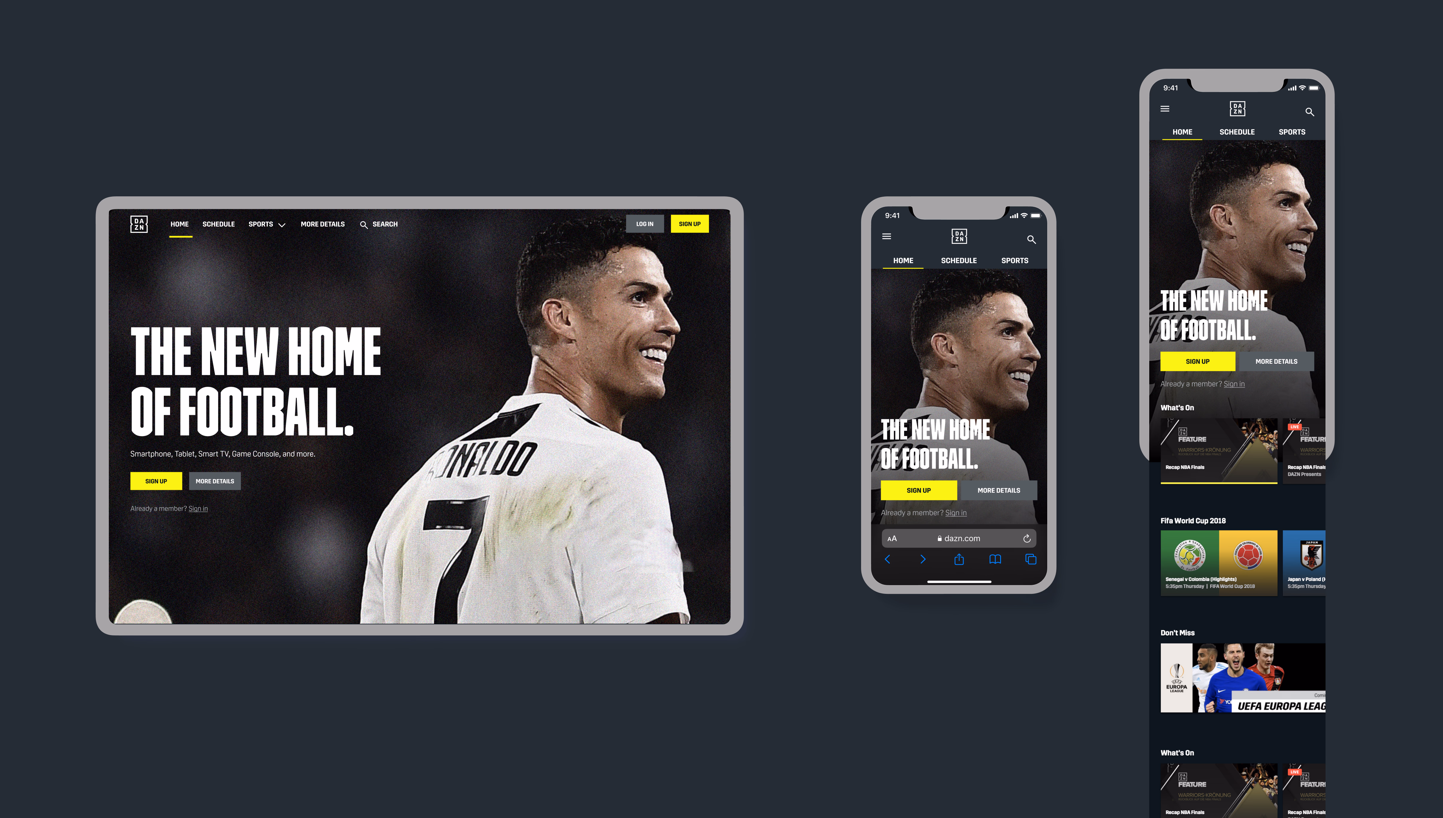
Mobile-first responsive design
To reinforce how this design could live in a responsive world, I also designed a mobile web variant using adaptive design techniques to lower cognitive load across mobile experiences.
Product-forward landing experience
New users could now engage with DAZN's content before signing up via a sign-out product view that built confidence and reduced barrier to conversion.