Implementing a multi-product design system built from the ground up
Overview
Building guidelines, best practices, and a unified design language
Building out guidelines, best practices, and a unified design language across multiple products. The Nevada design system enables the wider team to provide consistent and prompt design output from Figma, clear engineering handoff and responsive considerations.
Nevada has been an example for other design teams across the business to build their own, with the Sky Bet tribe taking our learnings, organisations, and structures to build their own design system out (Olympia), creating a great opportunity for alignment.
Context & Problem
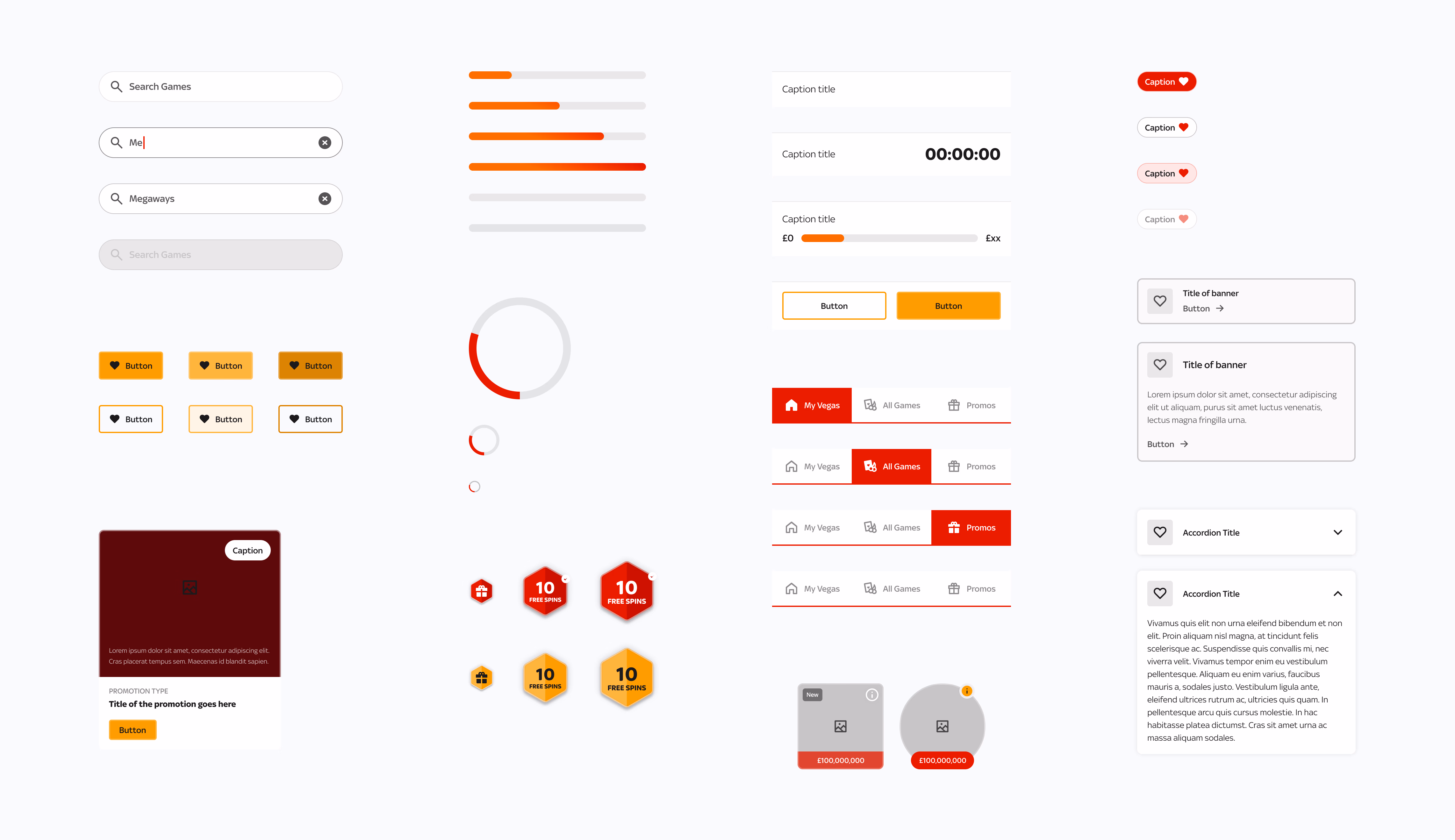
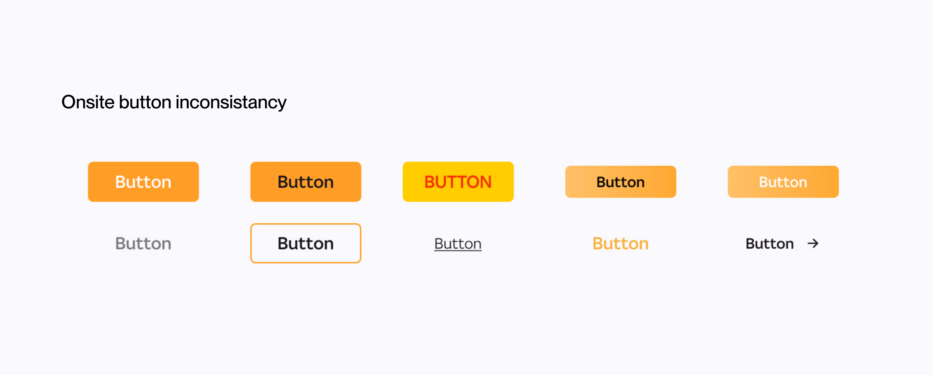
Inconsistency at scale had made it to the product
The design team needed alignment on several objectives: design output, design consistency, componentry use cases, engineer collaboration and design presentation. I led the foundational build of the design system across Web, iOS and Android, before growing and leading a small team of designers to scale it across the gaming products.
Inconsistent output across multiple products and various interpretations of components.
Passing around dated design files with confusion on what was old or new, with no single source of truth.
Design inconsistencies onsite, with the chain of file-sharing events making inconsistency visible to end users.
Create a shared vision on the design. Reduce complexity and ambiguity around components. Enable and facilitate collaboration and consensus. Create a foundation for product improvement.
Our Process
From tooling choice to a scalable atomic system
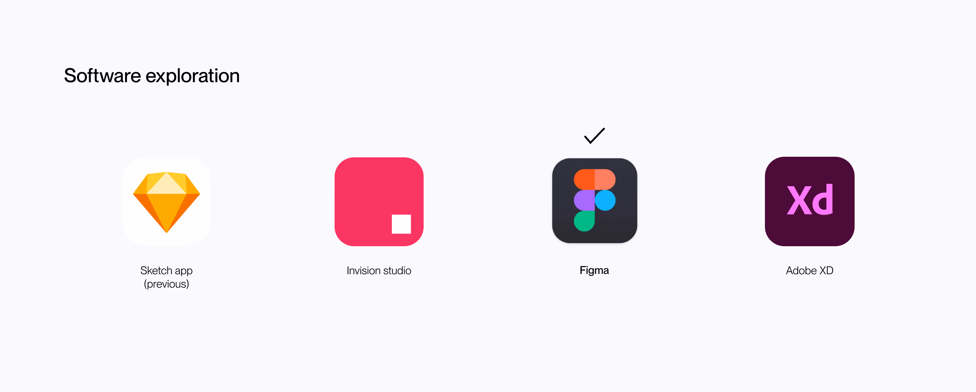
Choosing the right software
We chose Figma as the foundation: cloud-based files, sharing capabilities and design tool features that aligned directly with the problems we were trying to solve. This choice enabled real-time collaboration and a single source of truth.
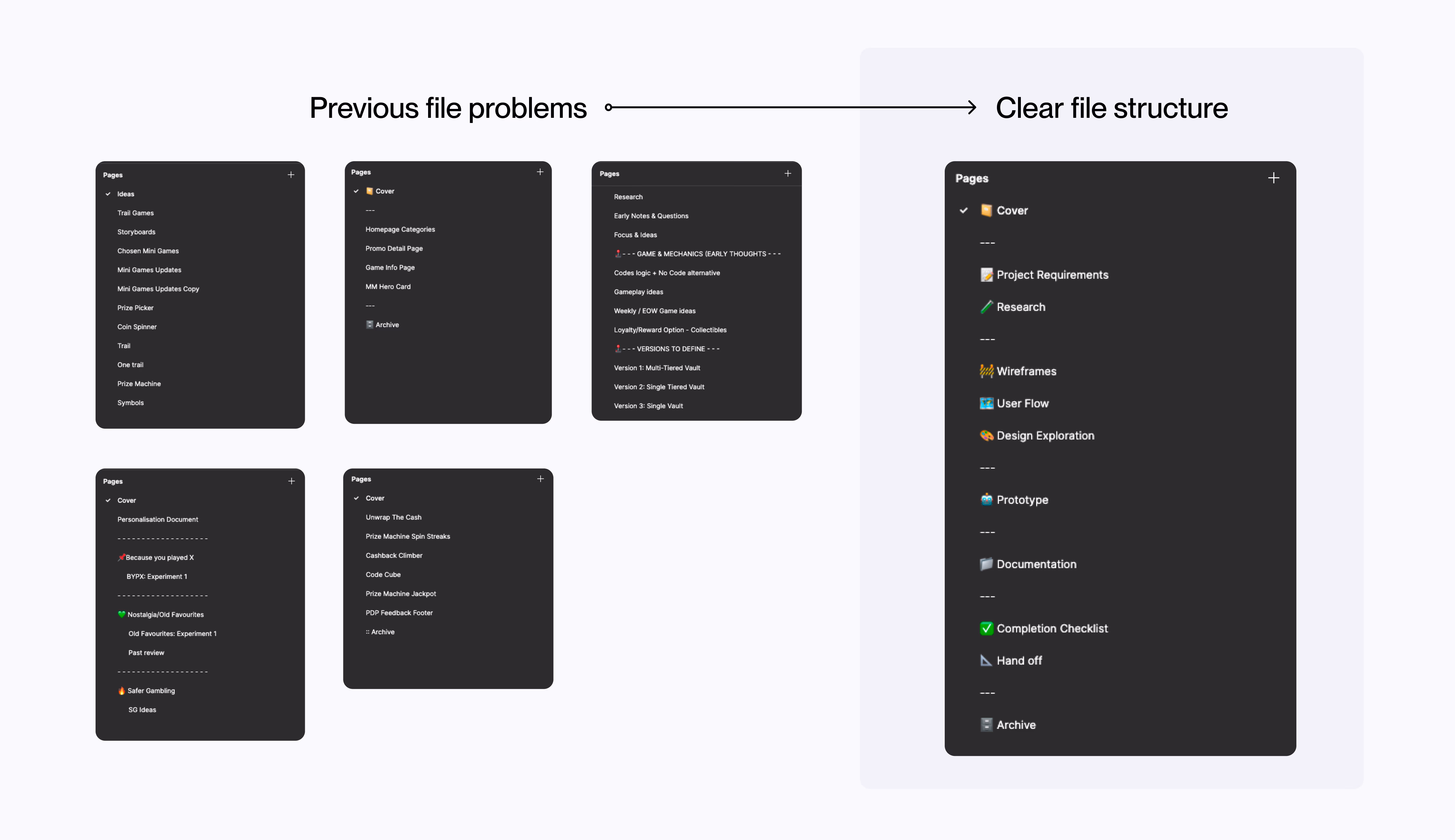
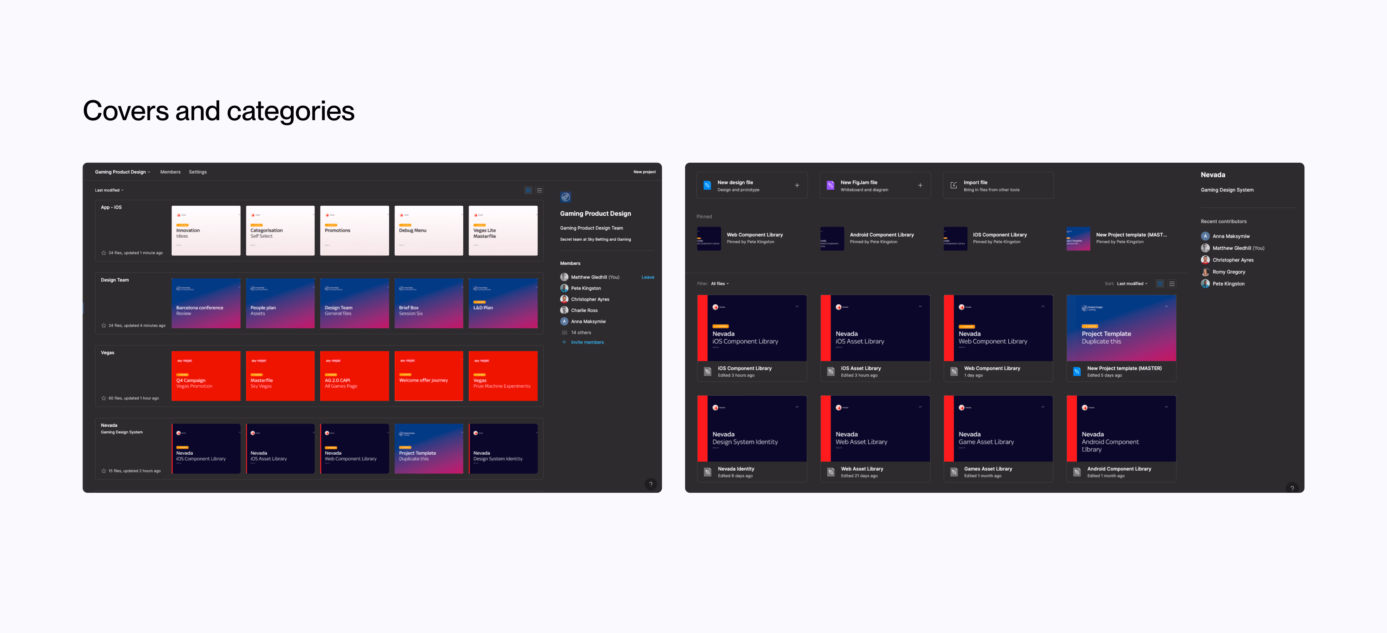
Organisation and file structure
One of the first areas we explored was setting proper guides and structure to enable a systematic and scalable design system. We identified issues with the current file naming system and the confusion it created during handover.
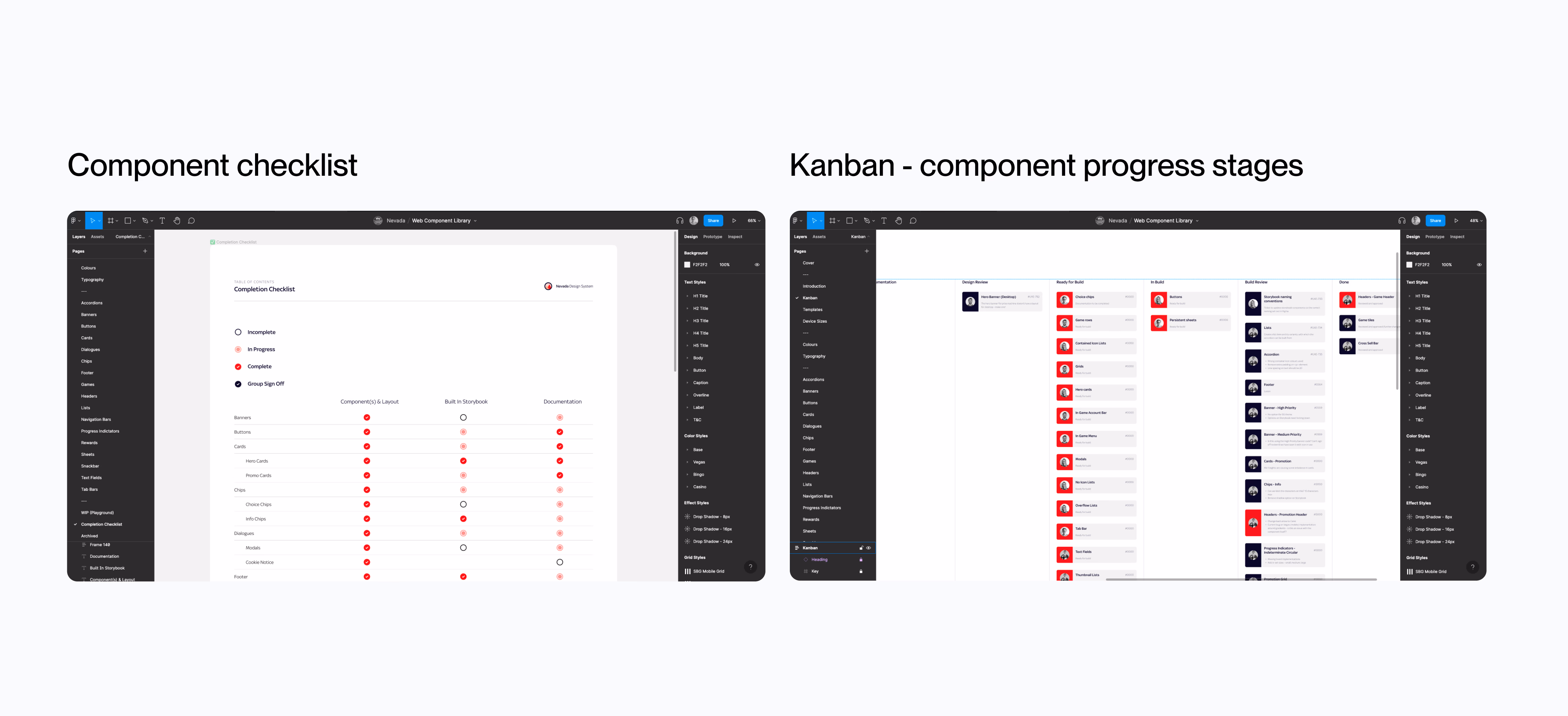
Structured weekly process
We set up weekly meetings to review both our component build checklist and the progress stages of each component as a team. This also gave the chance to work through design Q&A with the Nevada team and input from our UX engineers.
Scalable system architecture
A master file shared across the business contained basic design tokens: logos, typography style and colours, which could be input into each product library. Brand-agnostic elements used business-wide (like icons) lived in this shared file.
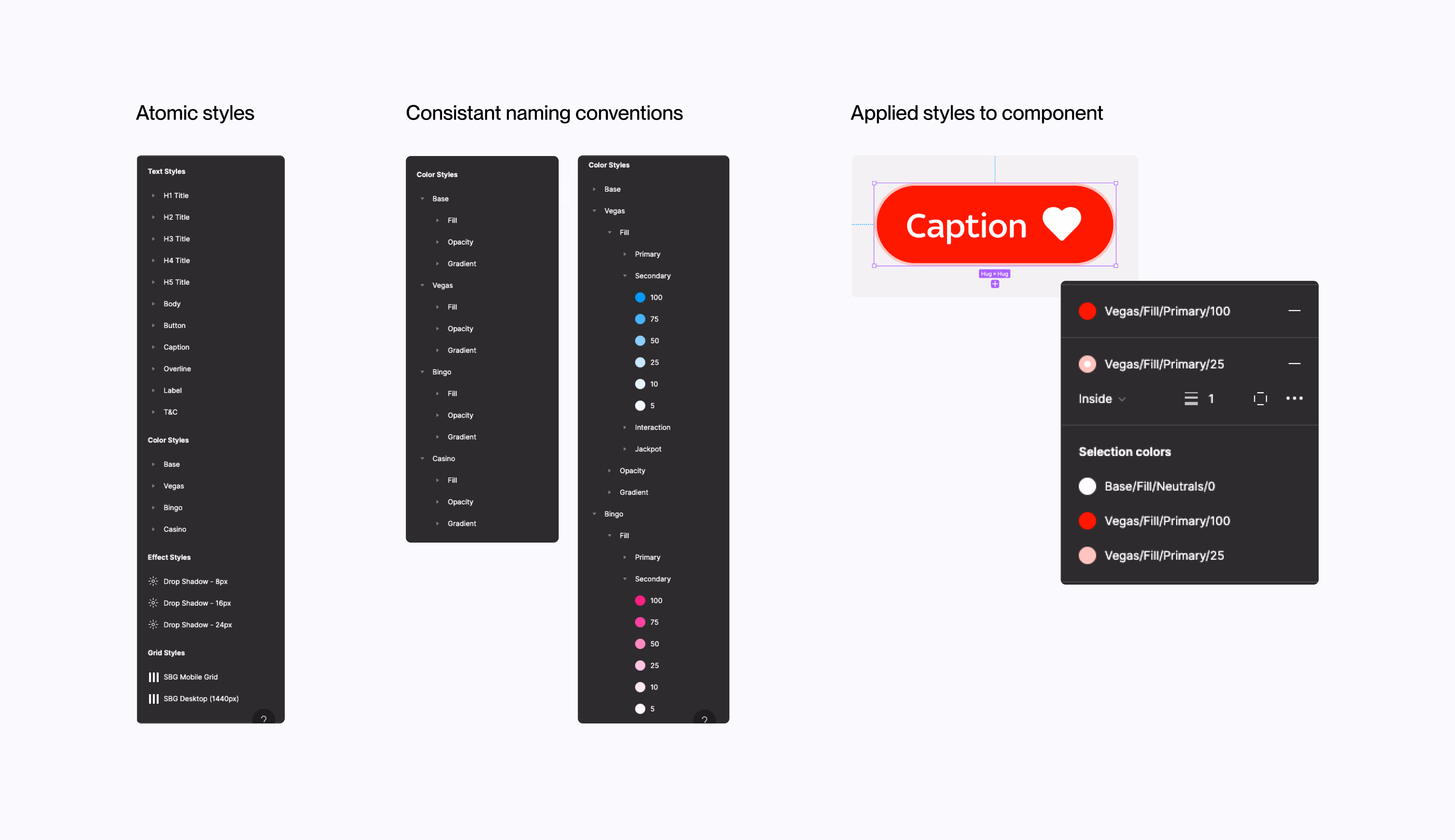
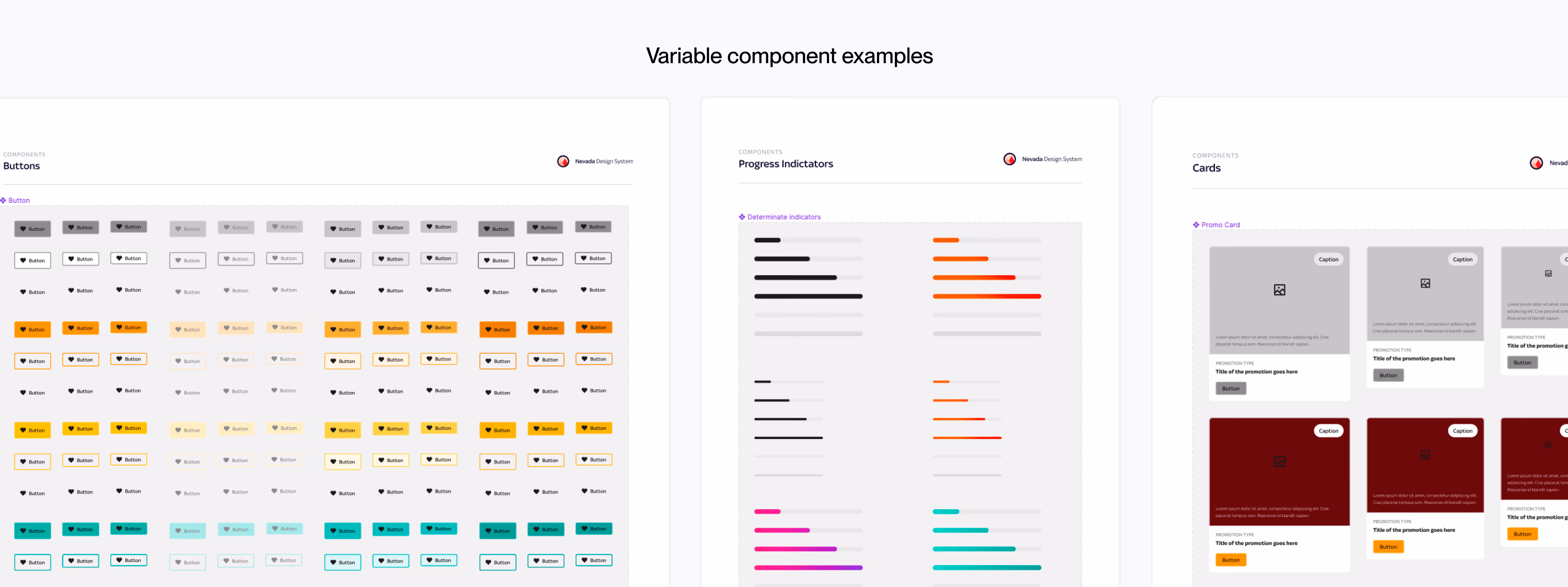
Atomic design approach
Built with scale in mind: atoms, molecules, organisms structured so that components could be composed and reused predictably, with easy-to-use components matched with best practices documentation.
Documentation & Collaboration
Built to be used, not just referenced
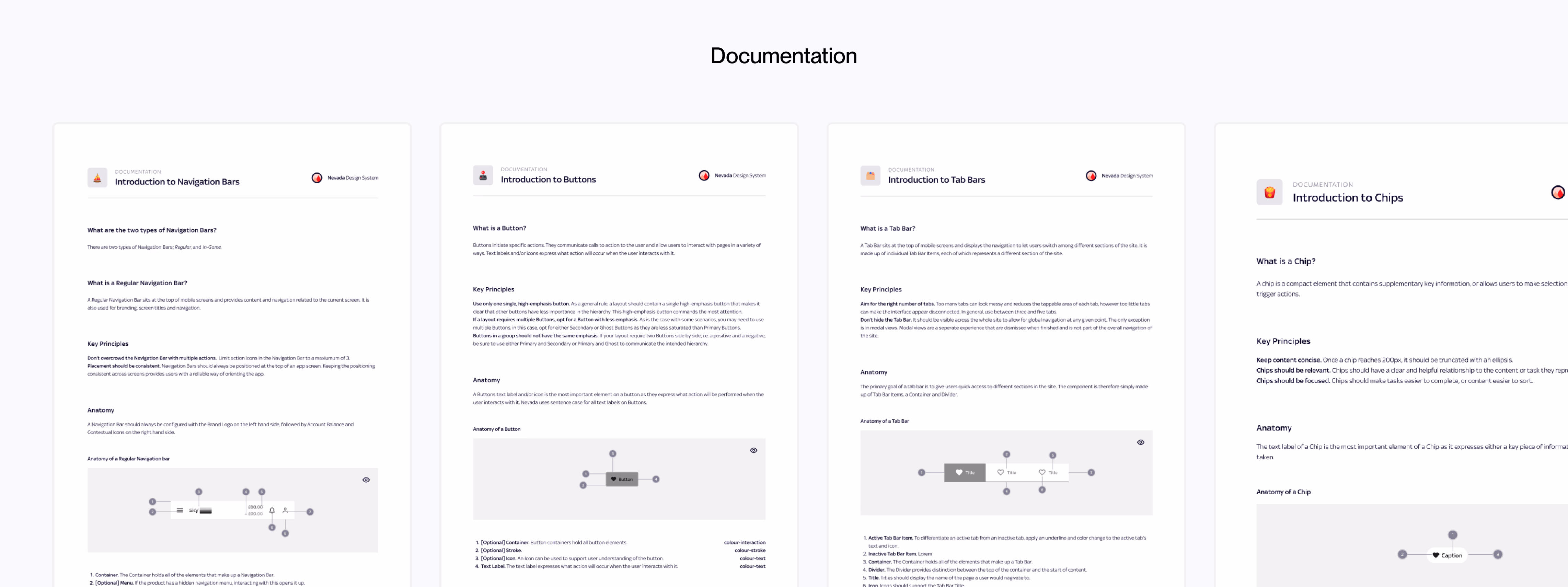
Robust documentation
For clarity and guidance on component use cases and structure, we provided robust documentation. During this process it also helped the Nevada team refine naming conventions, organisation and influenced some design changes.
Collaboration with UX engineers
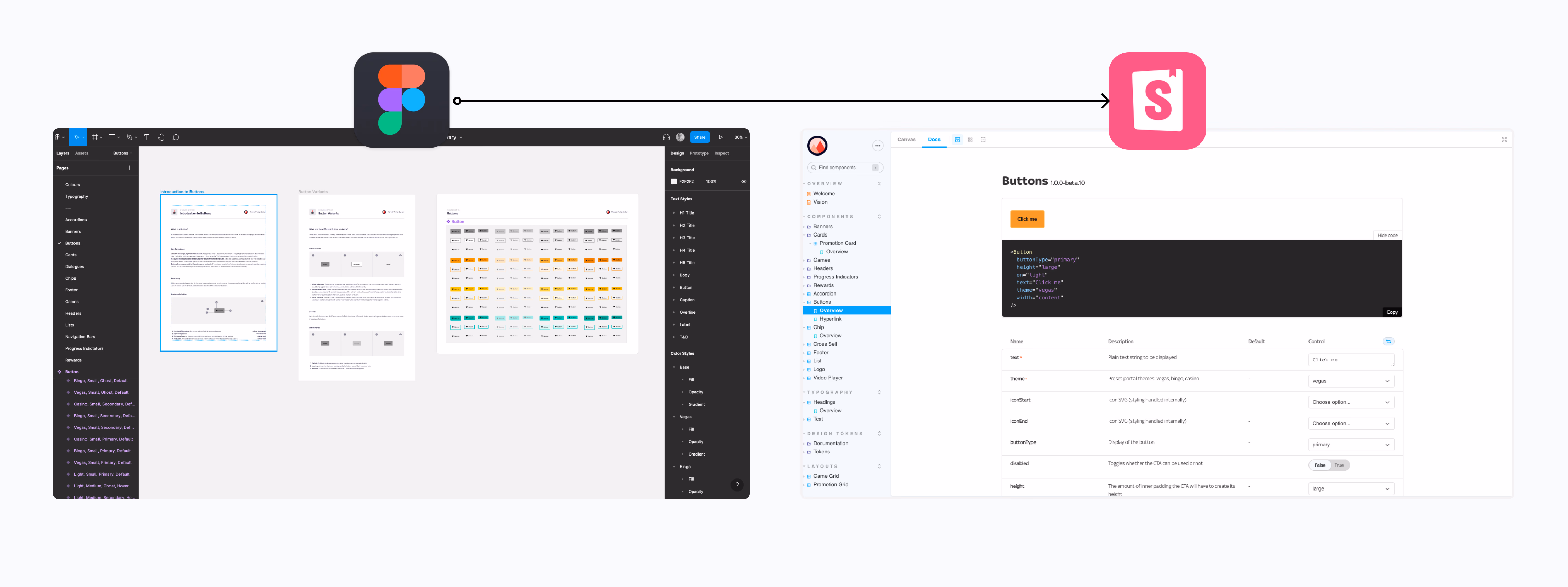
Working with UX engineers throughout the design system journey made handover smooth, with limited design Q&A after delivery. Components are built in Storybook, pulling from Figma source files directly.
Storybook integration
Components built in Storybook and linked to Figma source files was beneficial for referencing design, creating a single source of truth for both design and engineering simultaneously.
Impact
A system that scaled beyond the team that built it
Over a year since initial kickoff, both myself and the team continue maintaining the library, updating builds to keep up with best practices from Figma updates. Nevada has been an influence across the business, with the Sky Bet tribe taking our learnings and structures to build their own design system (Olympia).
Pixel-perfect handover
The design output is the biggest improvement: consistent and pixel-perfect handover on projects. Reduced project timelines in the design phase, directly reducing costs to the business.
Reduced product cost
Having the system built in Storybook means better implementation and reusability, which also reduces product cost overtime. Adoption still growing, leading to higher project output velocity.
Business-wide influence
Nevada became the example for other teams: the Sky Bet tribe built their own design system (Olympia) using our learnings, organisations and structures, creating alignment across the whole business.
The most valuable outcome wasn't the component library. It was the shared language and process it created between designers and engineers. That's what made it scale.