Build an experience that makes it easier for users to find a game they will love.
Overview
Solving choice paralysis in a catalogue with hundreds of games
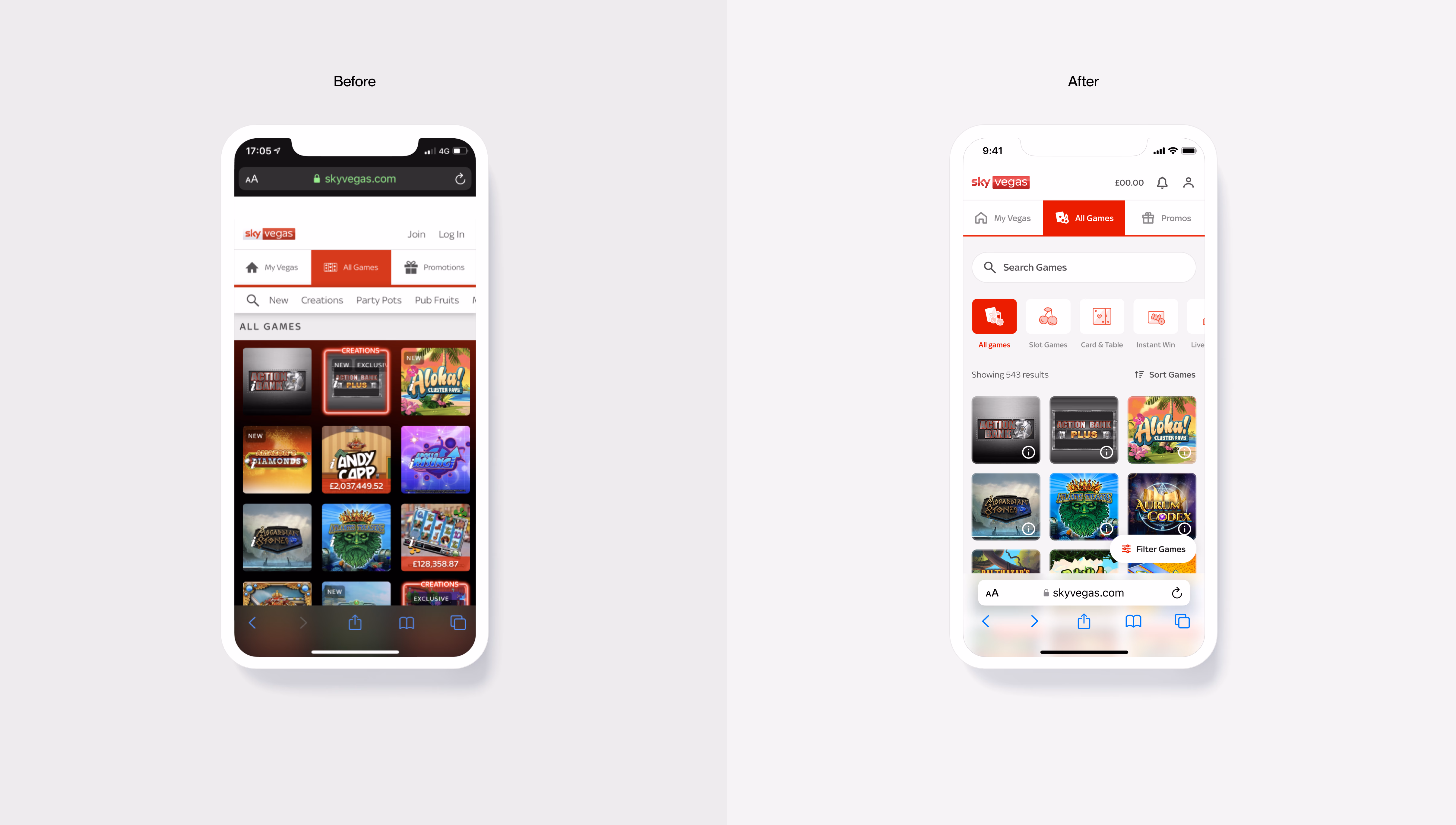
The "All Games" page was a high-traffic but low-conversion hub. With hundreds of titles, users felt overwhelmed by choice paralysis, and performance issues on mobile were driving bounce rates up.
I led a complete redesign of the game discovery architecture, implementing a high-performance smart-grid system, intuitive filtering, and a data-driven search experience. The result was a 640% increase in Game Launches and a 45% reduction in time-to-first-play.
Context
A new API created a window of opportunity
The business had been working on a new tech stack to update parts of the site, including a new API data infrastructure tied to the games catalogue. This infrastructure attached rich data points to each game, creating a significant opportunity to build better findability and discovery features across the whole site.
A new API data layer unlocked the ability to filter, sort, and surface games in ways that were never possible before, but only if the UI could make that power accessible to users.
Research & Discovery
A mixed-methods approach to understand what users actually need
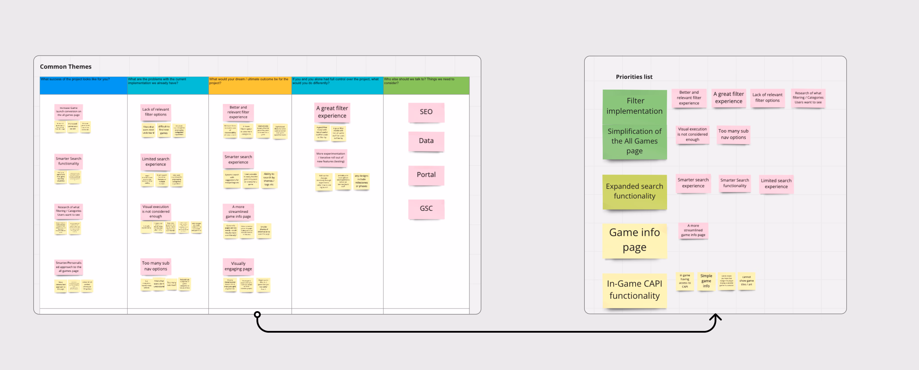
To gain a better understanding of what data points are useful for users, I worked alongside user researchers to conduct a series of research methodologies that informed our approach to the "All Games" page and the introduction of filtering.
Information Architecture Analysis
Mapped the current page structure to identify where users were getting lost across category hierarchies.
Card Sorting
Built a mental model of how users naturally group and think about game categories versus how the existing IA mapped them.
Filters Usefulness Matrix
Validated which filter attributes (theme, volatility, min stake, provider) were most useful and understood by real users.
Industry jargon ("party pots", "jackpot king") had very low user understanding. Duplication across categories caused confusion. Users needed richer context, not just a label, to make confident choices.
Ideation
Wireframes to stakeholder buy-in, before a single high-fidelity pixel
Designing with a user-centric mindset, I created wireframes to experiment with information architecture, category refinement and filter implementation. This helped steer early conversations with stakeholders and get buy-in at an early stage before high-fidelity design.
Navigation between major game categories
Reduced to 4–5 tabs to eliminate duplication, with "Live" as a business-priority sub-nav item. Cleaner navigation reduced cognitive load significantly.
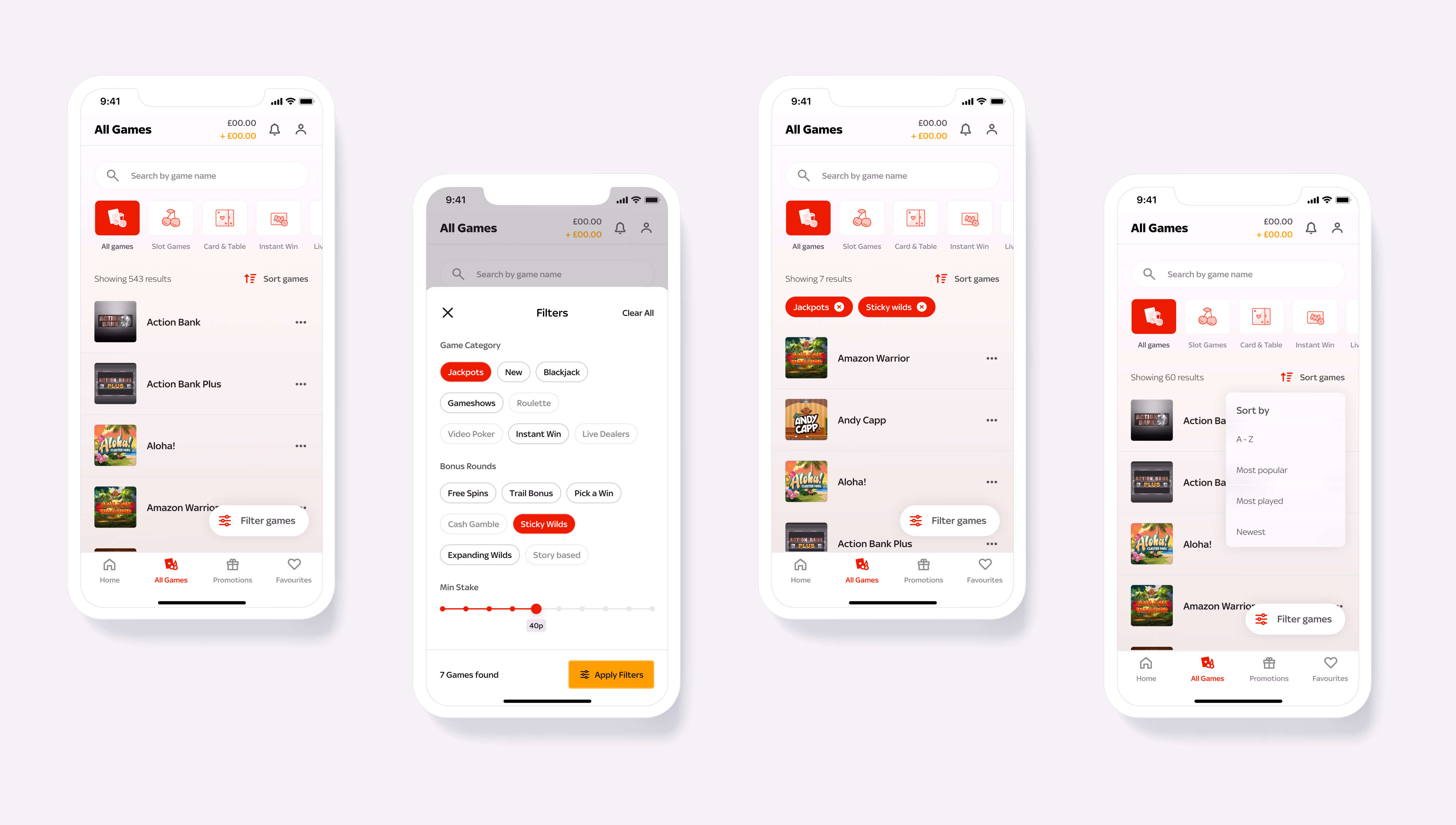
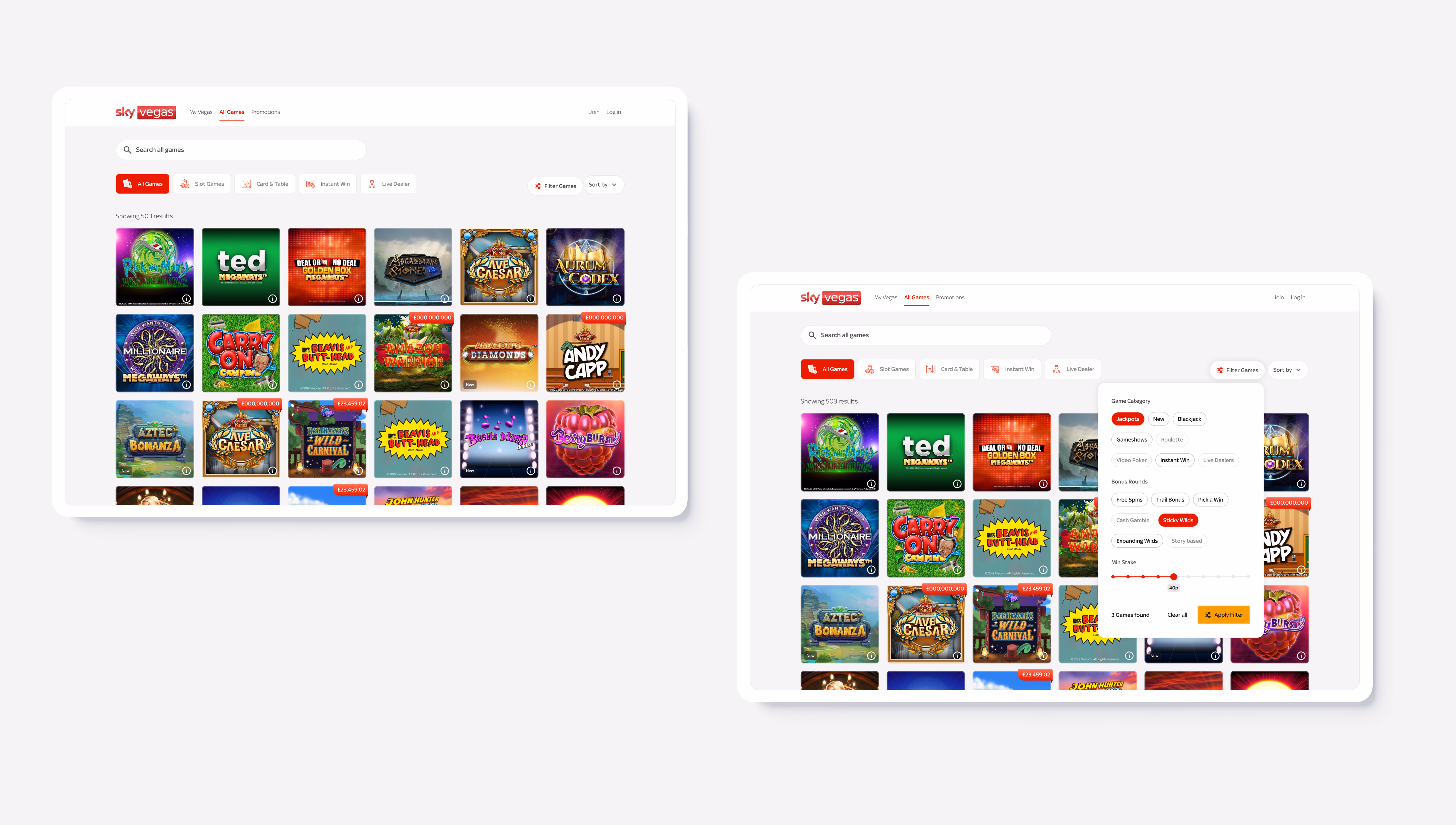
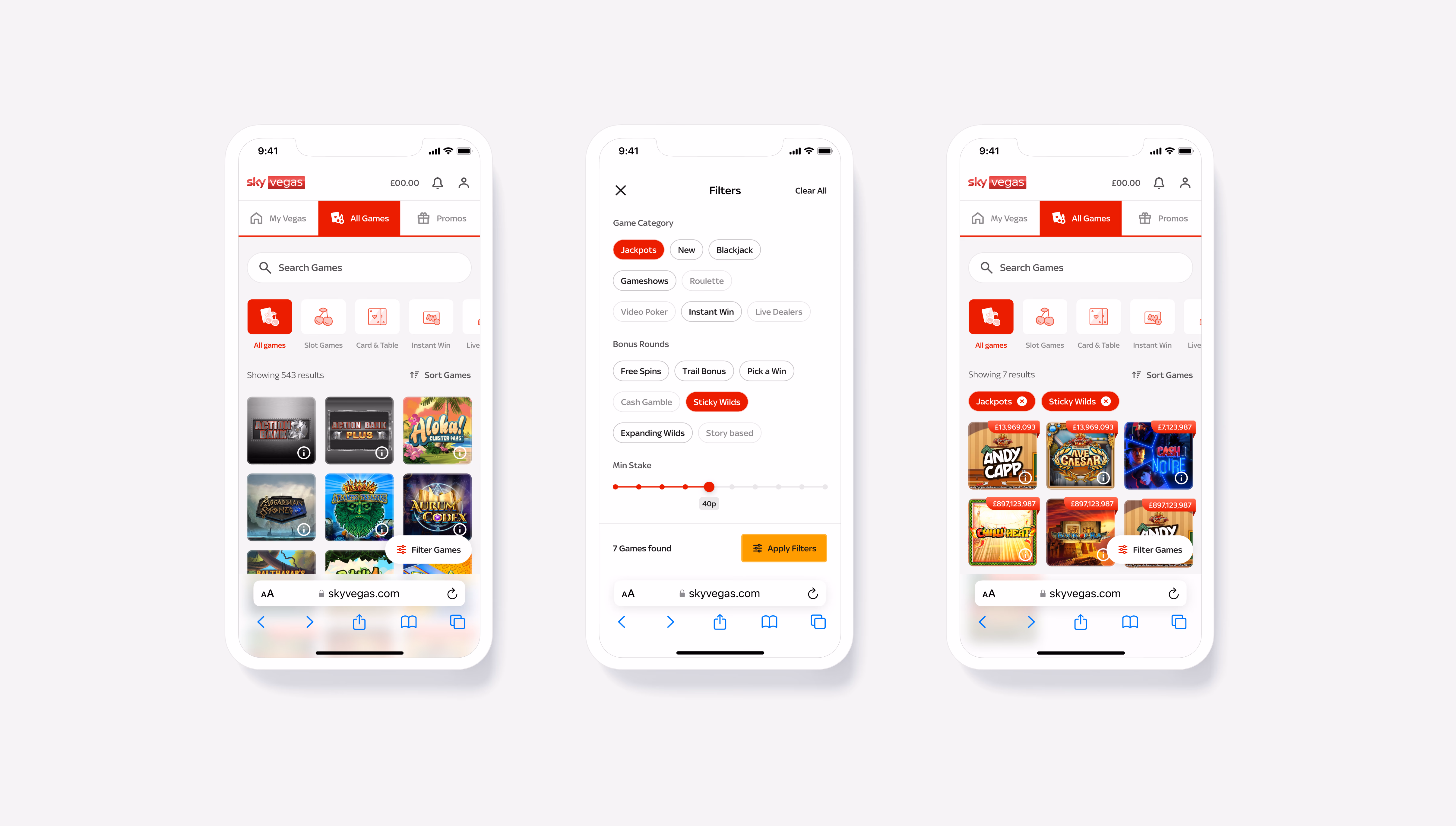
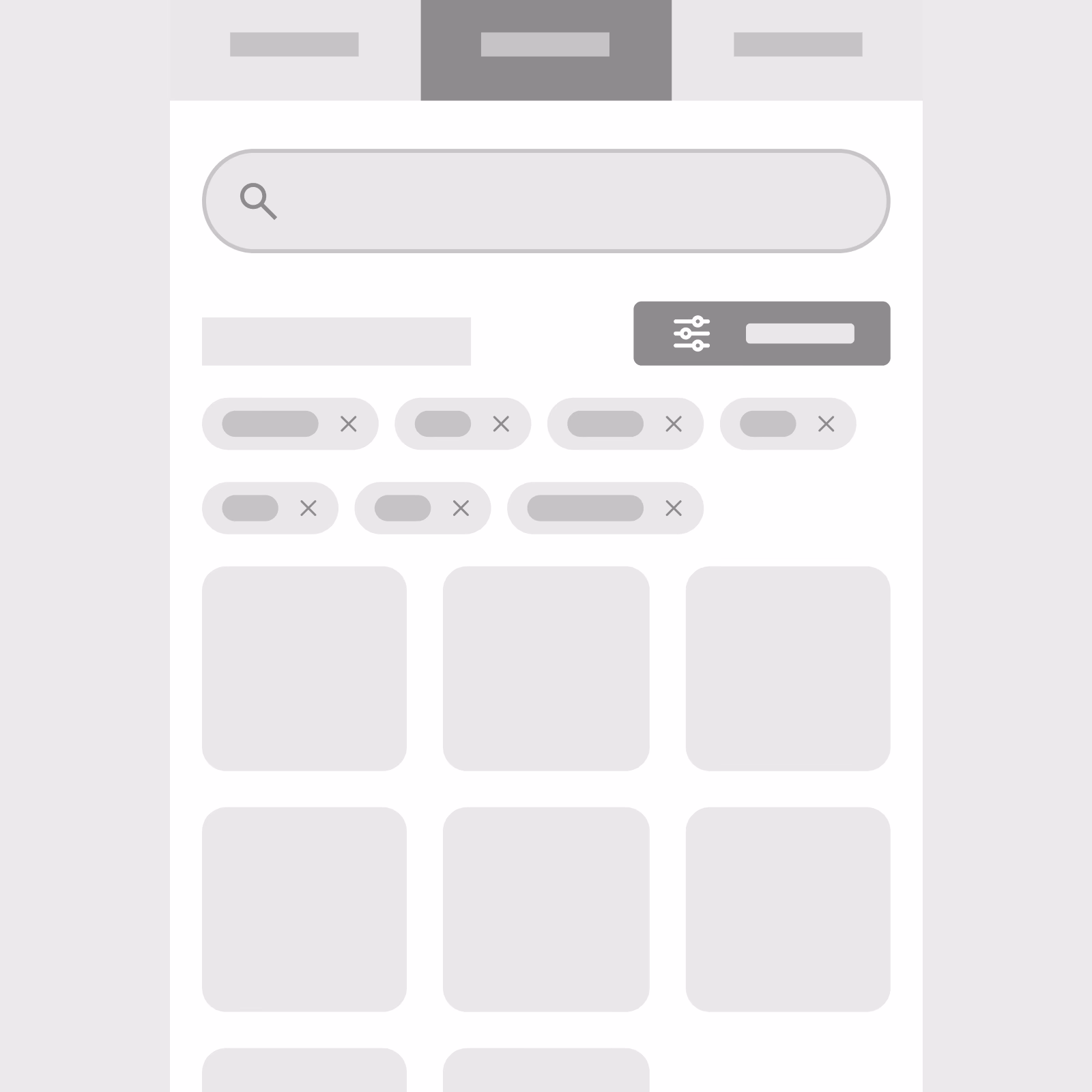
Filter placement
A sticky nav approach was chosen for its ease of access when scrolling the games list, tested across multiple variations to validate the right pattern.
Bottom sheet filter menu
After critique sessions and revisions, a bottom sheet pattern emerged as the most adequate approach: it doesn't interrupt the journey and handles the volume of content elegantly.
Filter tags on results page
Minimal friction between choosing and dismissing filters; active filter tags visible on the results page allowed users to snap filters on and off with a single tap.


Testing
Three core features validated through usability testing
Category understanding
Testing usability and understanding of categories that might be misunderstood. Created a bespoke set of icons that illustrated more detail to reduce ambiguity, increasing success rate on re-test.
Sorting games
Tested usability and understanding of sorting options. Found that users had clear mental models around "most popular" and "new", validating the approach before implementing.
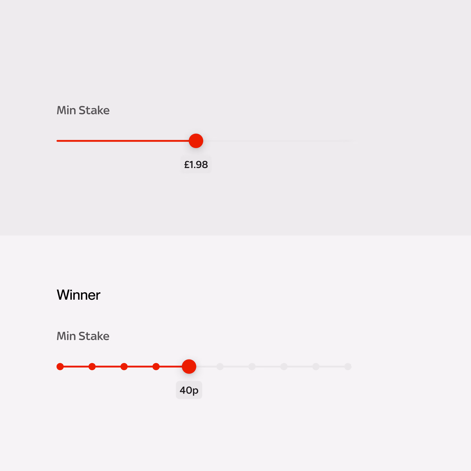
Filter placement & design
The pill filter execution outperformed alternatives, standing out more against the colourful game artwork. Users found game groups easily once they discovered the filter menu.
Games go up in an incremental staking pattern (5p, 10p, 20p, 40p). Rather than a linear slider, I implemented a stepped pattern matching this reality. The heavy majority of users preferred this; it felt more familiar and convenient for filtering staking amounts.
Handover & Impact
Shipped in phases, with engineers involved throughout
Throughout the process, engineers were involved to provide feedback on the constraints and viability of certain ideas. By the end of the project there was clarity on functionality and implementation. I provided regular design reviews on their stand-ups to foster relationships and quality outputs.
640% more Game Launches
The biggest single metric: the redesigned architecture dramatically increased the number of users who discovered and launched a game from the All Games page.
45% reduction in time-to-first-play
Smart filtering and clearer categories meant users found the right game significantly faster, directly improving key business and satisfaction metrics.
87% CSAT score
A near-perfect customer satisfaction score when users interacted with the updated page, validating that the experience genuinely served user needs.