Sky betting & gaming
Implementing a multi-product design system built from the ground up

Product designer
Responsibilities
Component build
Documentation
Visual Design
Workshops
Engineer collaboration
Platforms
Figma
Overview
Creating a design system was a unique opportunity to better position our team output and alignment across design and engineering. Through testing out different platforms and evaluating our current products we set out to build a unified multi product design system.
Building out guidelines, best practices, and a unified design language. The Nevada design system enables the wider team to provide consistent and prompt design output from Figma, clear engineering handoff and responsive considerations. The Nevada design system has been an example for other design teams around the business to build their own using our own as example and conversations around alignment.
Teams worked with
Product owners, Content, Engineers, Global marketing teams
The design team needed alignment on several objectives, such as design output, design consistency, componentry use cases, engineer collaboration and design presentation. The added benefits are faster output of design while keeping consistent design principles across the team.
A small team of designers was established to create a unified design system for the gaming products across web, iOS and android.
Problem
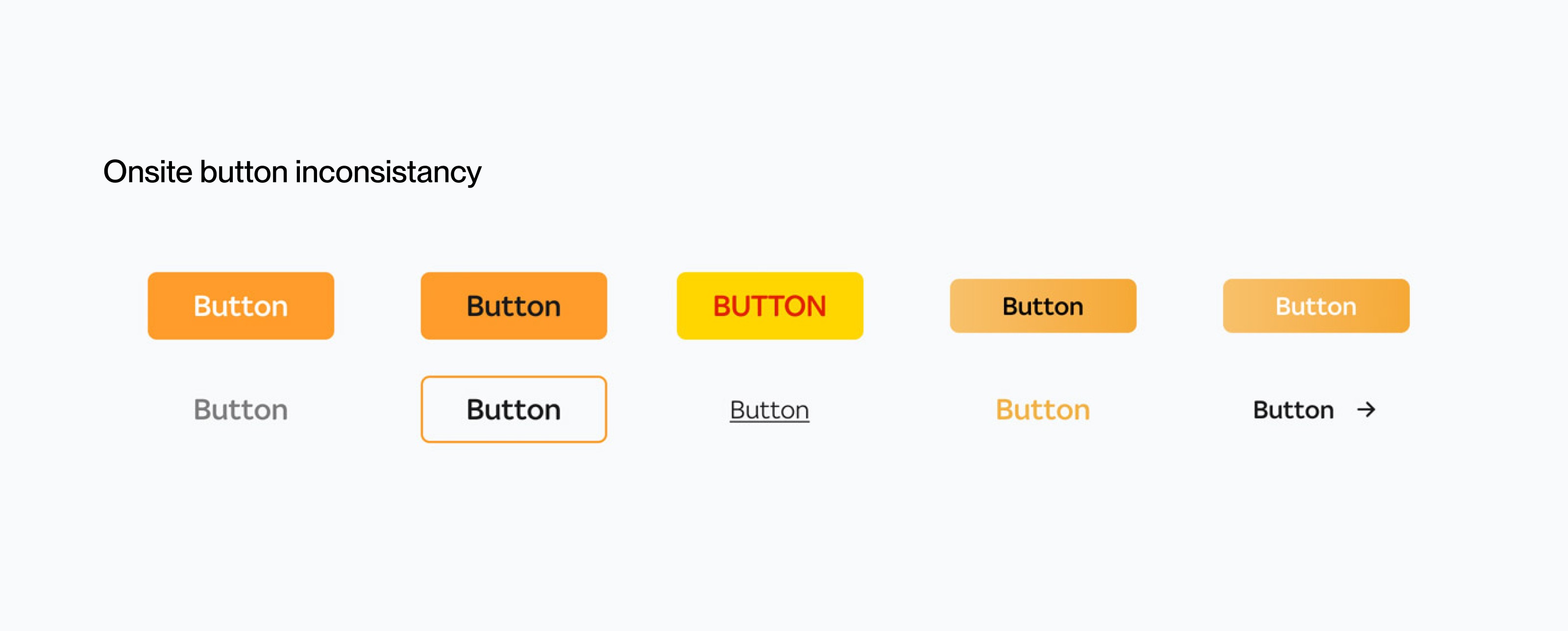
We had issues of inconsistent output across multiple products and various interpretations of components. Various issues with passing around files with dated design and confusion on what is old or new.
Over time, this chain of events has made this problem apparent onsite too, which has led to design inconsistencies that need to be corrected.
Opportunities
• Create a shared vision on the design.
• Reducing complexity and ambiguity around components.
• Enabling and facilitating collaboration and consensus.
• Creating a foundation for product improvement.
Project kickoff
A small team of four product designers were chosen to be the creators and guild members of the design system. Having a small team allowed us to be focused, streamline decision making and have a high level of quality control over the output.
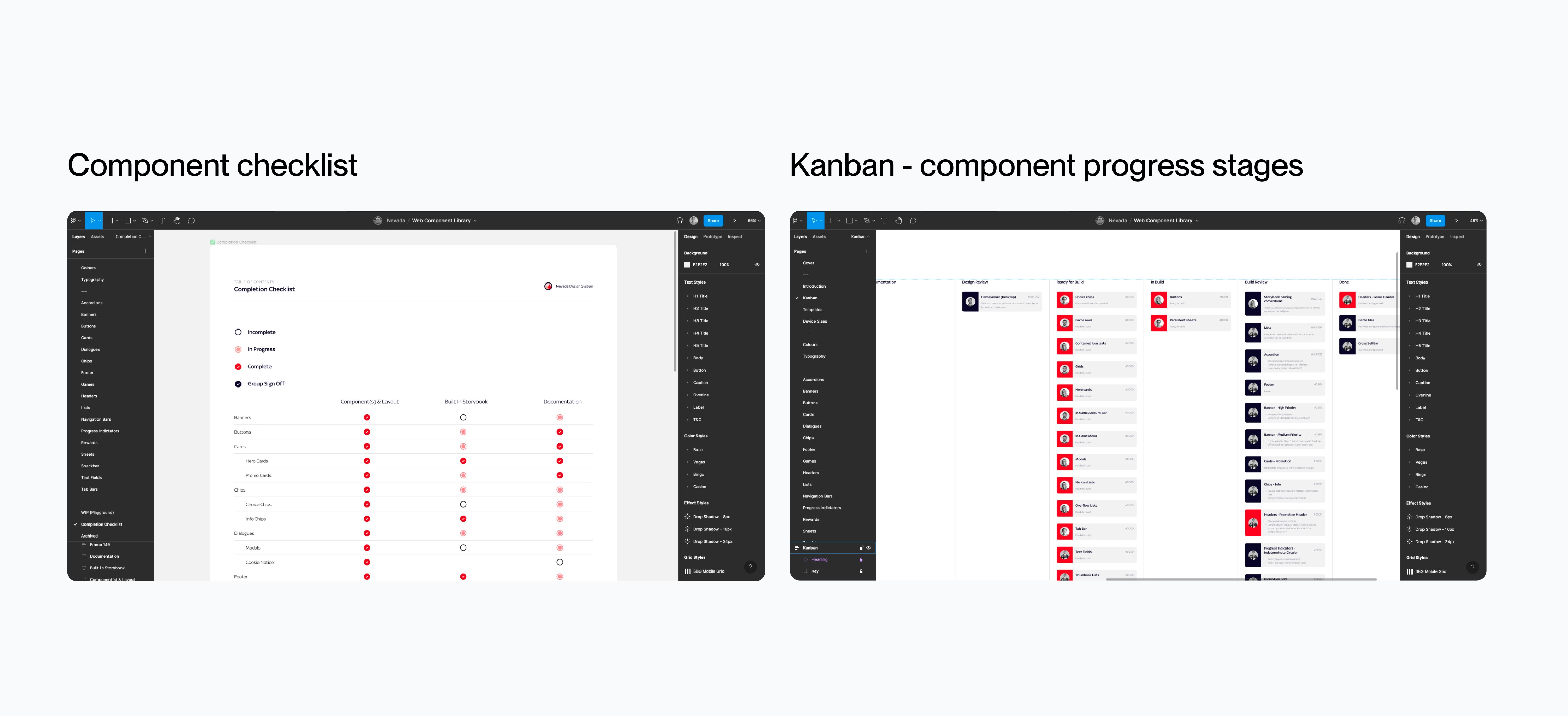
We started with an audit of our product and focused on the problem areas on both onsite and within our current design output. This helped lay a foundation to create checklists of project success.

Choosing the right software
At the time, our design tools had some flaws in the workflow, using sketch at the time meant files had to be well managed and timestamped updates, along with it created design output inconsistencies.
After trying different tools such as Adobe XD, Sketch cloud, Invision studios and Figma, we all found Figma to be the right tool to move forward with. The high-level benefits of using this tool were the cloud-based files, sharing capabilities and design tool features that aligned with what problems we are trying to solve.
Organisation and file structure.
One of the first areas we wanted to explore was setting proper guides and structure in place to enable a systematic and scalable design system. We identified a few things that are not working such as our current file naming system and the issues it creates when other designers are looking through previous work and the handover process.


Our process
Having a structured process in place meant the progress we make is impactful and efficient to the business. We set up weekly meetings to review both our checklist of component build and the progress stages of each component as a team. This also gave the chance to work through any design Q&A with the Nevada team and input from our UX engineers.
Scalable system
Create a design system with scale in mind was important to the team. We have other tribes such as the Sky Bet product which would need to be considered. Factoring that in, we had a master file that was shared across the business that contained basic design tokens such as logos, typography style and colours which can be input to each products library.
Also, we had brand agnostic elements that needed to be used business wide such as icons.

Atomic design approach
We set to take on the approach of atomic design. We started gathering of the atoms of our product. Looking at colours and their respective naming convention and how it can be applied across multiple brands. Typography and effect elements.

Easy to use components
After creating most of the common components out. We wanted to create a robust system that makes the design process smooth and minimise redundant tasks, while keeping consistent output. We set to build more complex components keeping in line with best practices.


Documentation
For clarity and guidance on components use case and structure, we provided robust documentation. During this process it also helped the Nevada team refine the naming conventions, organisation and influenced some design changes.

Collaboration with UX engineers
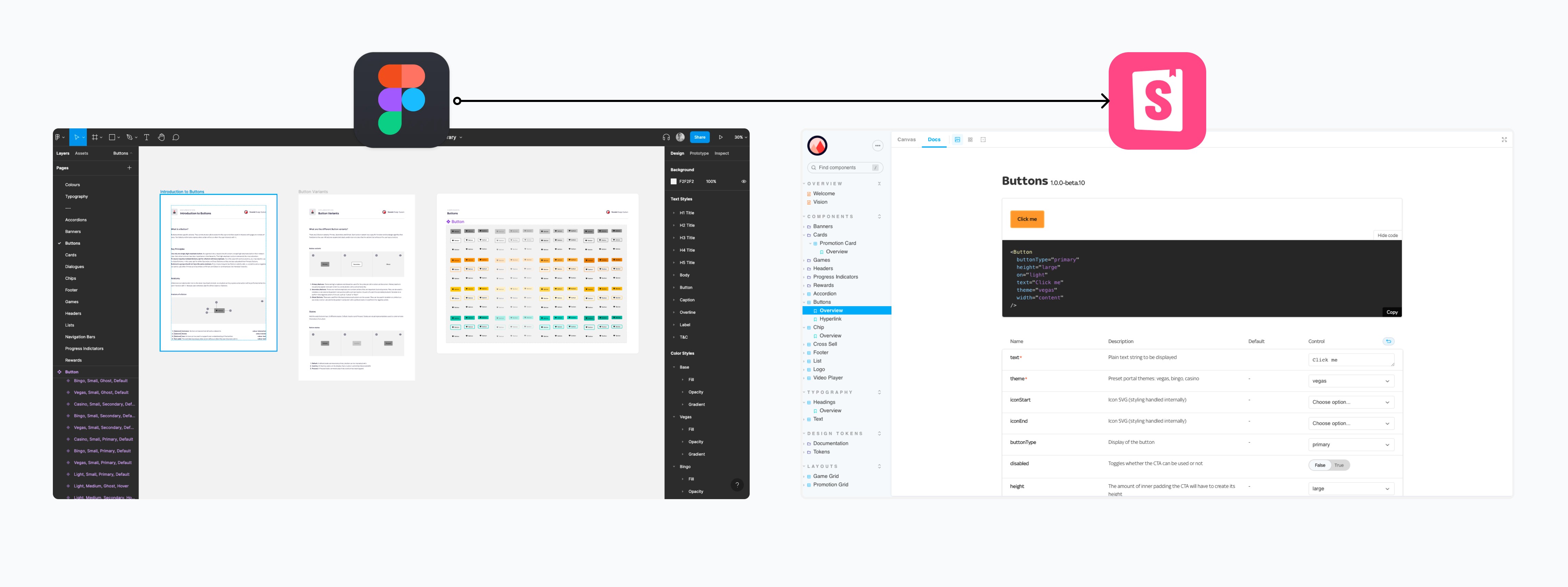
Working with the UX engineers throughout the design system journey handing over the components was a smooth process, with limited design
Q&A after. Components are built in storybook, which was beneficial for referencing design and this was pulling in the Figma source files.
Impact and summary
It's a year ago when the initial project kicked off and up to now, with myself and the team still maintaining the library updating builds to keep up with best practices from Figma updates.
The Nevada design system has been an influence across the business, with the Sky Bet tribe taking our learnings, organisations, and structures to build their own design system out (Olympia) which has been a great opportunity for alignment.
The design output is the biggest improvement with consistent and pixel perfect handover on projects. Reducing project timelines in the design phase, therefore reducing costs to the business.
Having the system built in storybook also means a better implementation and reusability which also reduces product cost overtime. Adoption is still an ongoing task which we aim to push and educate.

Example of some components from the Nevada design system
Let's connect, you can find me here.
Matthew Gledhill — Copyright © 2026